

When we describe transport vibration, we typically use Power Spectral Density (PSD) plots to define meaningful characteristics (frequency bandwidth, amplitude within discreet frequency bandwidth bins, and overall spectrum intensity).
Another common, maybe simpler way of describing a PSD is in-terms of its shape and intensity. PSD plots are assembled from plotting amplitude (y-axis) vs. frequency (x-axis) breakpoints. For laboratory package testing, the generally accepted frequency bandwidth of interest is 2-200 Hz. That bandwidth is based upon what we’ve collectively learned over time from performing transport measurements. A couple of common PSD profiles used in pre-shipment testing are shown below.
The type of transport vehicle (truck, train, aircraft), the load within that transport vehicle and the surface(s) over which the vehicle travels all influence the resulting shape of the PSD profile, as well as its corresponding overall intensity. Transport PSD shapes often include what we call zones peaks and valleys. From a testing perspective, we’re certainly interested in those zones of peak/greater intensity, and what they may be attributed to. In the examples below, the primary zones of peak amplitude represent the input from a truck’s suspension, its tires, and its rigid body structural members.
Standard profiles are good, general representations of a transport mode, but performing actual transport measurements provides the ability to identify and characterize key traits of a transport vehicle, as well as potentially identifying changes in the ri
For instance, it’s possible to distinguish an air-ride and leaf-spring vehicle suspension based upon the measured PSD. It’s also possible to distinguish the speed, or the range of speed of the vehicle and the quality of the tires/wheels. With aircraft transport, you can often determine if the aircraft is a turboprop or jet aircraft, as well as things like when the engines spool up, down, etc.
As a product and/or protective packaging designer, understanding the environmental inputs at that more granular level can provide critical design inputs. In each mode of transport, do those areas of peak frequency inputs coincide with my product’s critical natural frequency(s)? If I’m shipping a piece of capital equipment in a large crate, does that crate have a natural frequency that coincides with the vehicle suspension or tire input ranges? If so, you have the information necessary to allow you to change either the product design, the protective packaging, or even the environment/mode/vehicle that you will use to transport that product.


A Practical Example
I recently experienced a situation where my car had developed a noticeable wobble, resulting in the car feeling like it was shaking abnormally intensely from side-to-side. After walking around and looking at my tires, I found that there was a bulge that was forming on one of the rear tires, probably due to hitting a curb excessively hard, or something similar.
Instead of responsibly, and immediately addressing the issue from a safety perspective – as a measurement geek, the first thought I had was to capture the dynamic and see what it looks like – then I would fix the problem. To fully document things, I decided to use a SAVER 9XGPS, a SAVER 3D15, a couple of water-filled growlers and GoPro cameras to document the response of the liquid while traveling at different speeds, over different types of roadways.
I used an instrument setup that included 1,000 Hz. sample rate on the internal triaxial accelerometer, capturing 2-second events, every two seconds, which allowed for contiguous recording of my various vehicle journeys. The SAVER 9XGPS was mounted rigidly to the cargo area, nearest the tire with the bulge.
I proceeded to head out on a predetermined route – a loop of about 15 miles in length, which included local surface roads, higher-speed country roads and a short segment of freeway. SaverXware allows for plotting captured SAVER 9XGPS events in Google Earth, with each event represented by a vertical bar.
The taller the bar, the more intense the measurement. The red events represent the 99th percentile of the population, the orange events the 95th, the yellow the 90th and the green the 80th and below. This allowed me to focus in on events where I might expect to have the largest dynamic inputs originating from each of the different roadway types.I proceeded to head out on a predetermined route – a loop of about 15 miles in length, which included local surface roads, higher-speed country roads and a short segment of freeway.
Each captured SAVER event is plotted below in Google Earth, with each event represented by a vertical bar. The taller the bar, the more intense the measurement. The red events represent the 99th percentile of the population, the orange events the 95th, the yellow the 90th and the green the 80th and below. This allowed me to focus in on events where I might expect to have the largest dynamic inputs originating from each of the different roadway types.
In addition to the noticeable wobble felt from riding in the car, it became evident that there was also both an audible, and visible clanking of the glass bottles together in response to the lateral frequency dynamic. That response changed in volume and intensity, depending on the speed at which I traveled.In addition to the noticeable wobble felt from riding in the car, it became evident that there was also both an audible, and visible clanking of the glass bottles together in response to the lateral frequency dynamic. That response changed in volume and intensity, depending on the speed at which I traveled.
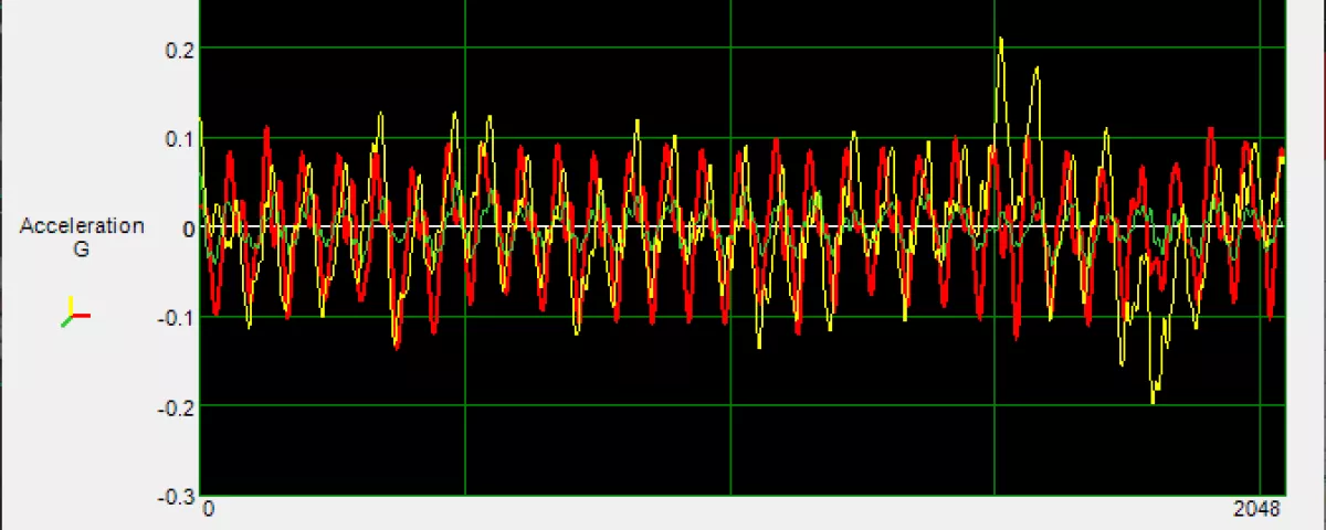
When looking at individual time-domain events where the bottle interaction was prominent and noticeable, it was evident that the lateral dynamic (red) was just as large, if not larger than the vertical input (yellow). When any combinations of the SAVER’s accelerometers signals are equal in amplitude at a discreet frequency, it’s indicative of a complex, simultaneous multi-degree-of-freedom motion.
That unique motion will generate product/component/package responses that cannot be replicated with single degree of freedom inputs. For instance, if you look at the labeling on the bottles, there is evident wear and scuffing, which is associated with the bottles moving independently from one another. That response results in small, out of phase motions which creates friction, and finally results in that labeling wear. Without including the lateral component of the dynamic, you wouldn’t be able to replicate that clanging interaction between the bottles.
Using SaverXware’s Vector Visualizer, I can look at just one cycle of the oscillatory content in the above time-domain event and visualize the changing direction of the input motion. For this example, that motion can be best visualized by focusing on the right-hand, front SAVER view in the video below. The white triaxial resultant with red indicators relates to the direction of the measured input, which in this example indicates more of a rotational input, versus just vertical, or translational. This Visualizer utility is much more powerful in the application when things are animated by “playing” the event, which can be initiated below.

Generating a PSD plot from that one time-domain data shows that the sinusoidal characteristic had a primary resonant frequency characteristic of about 14.5 Hz. In addition to the significance of the input on both the lateral and vertical channels, one could expect that if their product, package or unit load possessed any natural frequency(s) close to that 14.5 Hz., there would be a significant risk of damage.
Does that frequency and corresponding amplitude change with vehicle speed? In Part 2, we’ll explore how we can predict and visualize tire characteristics when considering different tire types, sizes and speeds.